

A real cardboard-box photograph in Harmony, California; illustrative photo, not a seller endorsement. Photo: Tim Mossholder / Unsplash
Ecommerce Checkout: Hidden Charges और Confusion कैसे कम करें?
Ecommerce ResearchOnline store के checkout में साफ prices, optional add-ons, delivery और return information कैसे रखें। छोटे sellers के लिए practical customer-experience guide।
On this page
Customer product चुनकर checkout तक पहुँचा और अचानक extra item, delivery fee या subscription दिखाई दी। अब उसे पीछे जाकर समझना पड़ रहा है कि कौन-सी चीज उसने खुद चुनी थी। छोटे ecommerce store के लिए ऐसी confusion केवल design की समस्या नहीं; यह customer का भरोसा भी प्रभावित कर सकती है।
भारत के Department of Consumer Affairs ने ecommerce platforms को dark patterns पहचानने और हटाने के लिए self-audit पर जोर दिया है। यहाँ अपनी store journey जाँचने की practical checklist है। पूरी legal compliance केवल इससे तय नहीं होती; applicable requirements अपनी actual operation के अनुसार देखें।
Product Page से सही Variant दिखाएं
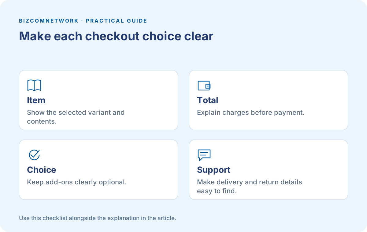
Size, colour, quantity और included items स्पष्ट हों। Customer को image देखकर अलग expectation और checkout पर अलग product न मिले। Out-of-stock variant पर order लेने की स्थिति हो तो delivery की बात साफ बताएं।
Gift hamper की photo में decorative basket है लेकिन package में शामिल नहीं, तो पहले बताएं। Photo जितनी सुंदर हो, actual contents उससे अलग नहीं समझ आने चाहिए। Clear description कई post-purchase queries पहले ही कम कर सकती है।
Amount को सही जगह समझाएं
Product price, delivery charge और लागू दूसरे charges relevant stage पर स्पष्ट रखें। Final payment से पहले customer पूरा payable amount देख सके। Charge किस वजह से है, wording सरल रखें।
Wrapping optional है तो उसकी price और selection अलग होनी चाहिए। Product कम price में दिखाकर जरूरी charges सबसे आखिर में जोड़ना customer को comparison करने से रोक सकता है। Amount बदलने की हर जगह review करें।
Optional Add-ons वास्तव में Optional रहें
Customer ने warranty, donation या gift service नहीं चुनी है तो उसे बिना साफ choice cart में जोड़ने से बचें। Remove करने का रास्ता भी उतना स्पष्ट हो जितना add करने का।
Checkout के लिए account बनाना जरूरी हो तो उसका कारण समझाएं। Marketing messages की consent और order के लिए जरूरी communication अलग जरूरतें हो सकती हैं। Form में दोनों को एक confusing sentence में न मिलाएं।
Delivery का Promise Process से मिले
Dispatch और delivery अलग stages हैं। Store दो दिन में dispatch करती है, इसका मतलब हर शहर में दो दिन में delivery नहीं है। Supported areas और estimate सही शब्दों में लिखें।
Pincode डालने के बाद information बदलती है तो customer को समझ आए। Product available है लेकिन selected area में service नहीं, यह payment के बाद बताने के बजाय पहले स्पष्ट करना बेहतर अनुभव देता है।
Return Information आसानी से मिले
कौन-सी items returnable हैं, request का तरीका क्या है और conditions कहाँ पढ़ें, यह visible रखें। सभी items की policy एक जैसी नहीं हो तो product-specific difference बताएं।
Policy page में लिखा है लेकिन checkout पर opposite promise है तो दोनों copy साथ review करें। Customer-facing terms और support team का actual process मेल खाना चाहिए। अपने business पर लागू नियमों की अलग जाँच करें।
Error पर Customer की मेहनत बची रहे
Payment fail हुआ तो स्पष्ट status मिले। बिना confirmation के customer को यह न लगे कि order निश्चित बन गया है। Duplicate payment या order की आशंका हो तो clear help path दें।
Test में invalid address, unavailable pincode और changed quantity देखें। Form error के बाद सारी entries मिट जाती हैं तो visitor को फिर वही मेहनत करनी पड़ती है। Relevant data को उचित तरीके से बनाए रखना उपयोगी सुधार है।
Mobile Checkout की अपनी Review करें
Phone पर product चुनें, variant बदलें और final amount देखें। Keyboard के पीछे button छिप रहा है? छोटा checkbox गलत tap से select हो जाता है? Extra popups customer को बार-बार रोक रहे हैं?
Test data और controlled payment setup इस्तेमाल करें। Recording रखें तो customer या payment की sensitive information सुरक्षित रखें। ऐसा evidence बनाएं जिससे team समस्या दोहरा और ठीक कर सके।
Support Questions से Design सुधारें
बार-बार लोग पूछ रहे हैं कि item में क्या शामिल है या refund कहाँ request करें, तो संबंधित page पर बात स्पष्ट करें। केवल support reply का template बढ़ाना पर्याप्त नहीं होगा।
Monthly review रखें: सबसे सामान्य confusion, affected page और सुधार का जिम्मेदार व्यक्ति। बदलाव के बाद journey फिर चलाएं। Transparent checkout में हर decision समझ आता है और customer अपने चुने order पर भरोसे से आगे बढ़ सकता है।
Frequently Asked Questions
क्या Add-on पहले से Select रखना ठीक है?
Customer की clear choice और applicable requirements देखें। अनचाही item जोड़ने वाले design से बचें।
Delivery Estimate कहाँ दिखे?
Payment से पहले relevant estimate और conditions मिलें। Dispatch और delivery को अलग समझाएं।
क्या यह पूरी Legal Checklist है?
नहीं। यह customer-experience review है। Products और operation पर लागू requirements अलग जाँचें।
Article at a glance
- Written by
- Rohan Mehta
- Published
- 17 Oct 2026
- Reading time
- 5 minutes
- Topic
- Ecommerce Research
Read More Blogs

Packaging Suppliers in Delhi: छोटे business के लिए boxes और samples कैसे चुनें?
Delhi की packaging companies की listings और उपलब्ध contact numbers देखें। Product fit, samples, printing, order quantity और repeat-order specifications समझने की practical guide पढ़ें।

Top 10 Courier Services in Delhi: parcel भेजने से पहले ये details जरूर पूछें
Delhi की courier service listings और उपलब्ध contact numbers देखें। Pickup, packaging, weight, tracking और delivery की शर्तें समझकर document या business parcel भेजने की तैयारी करें।

Festive Shopping में AI Search कैसे मदद लें? खरीदने से पहले ये तुलना करें
Festive shopping में AI answers, YouTube reviews और visual search को कैसे जोड़ें? Product model, final price, seller और delivery checks की हिन्दी guide।
Be the first to share your thoughts.
Comments 0